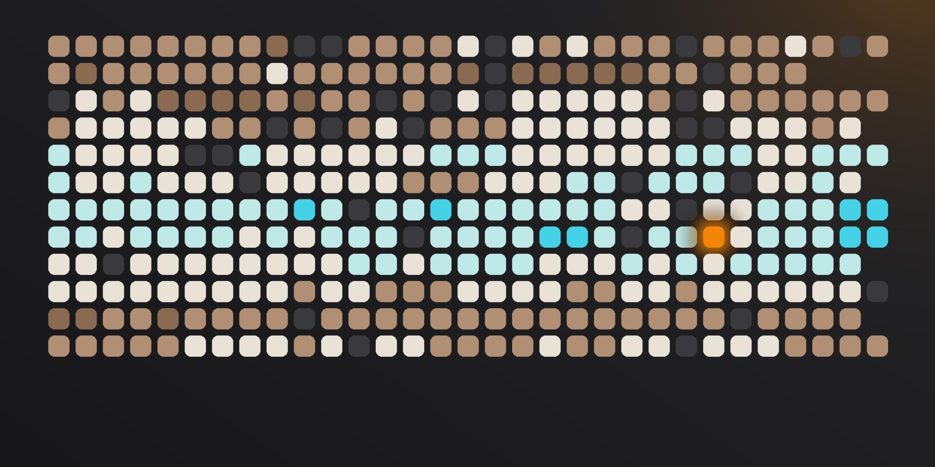
Three hundred and sixty-five squares. One for each day. Each one coloured by how that day felt.
That's the whole idea, and it's why it works. A year of your life is too much to hold in your head. Ask anyone how last March went and you'll get a shrug. But a year of your life as a grid of colour is something you can take in at a glance. Seasons show up. Rough patches show up. So do the long, quiet stretches where things were simply fine, the ones you'd never remember otherwise.
This guide covers what a Year in Pixels is, how to start one, how to choose a colour key you won't abandon in February, and what people tend to find the first time they look at a full grid.
What is a Year in Pixels?
A Year in Pixels is a visual mood tracker method. Simply put, it's a grid with twelve columns, one per month, and thirty-one rows, one for each possible day. Every evening you fill in one square with a colour that matches how the day went.
It grew out of the bullet journal community, where people drew the grid by hand on the first page of a new notebook, and it spread because it's the rare tracking habit that pays you back visually. A list of mood ratings is a list. A grid of colour is a picture of your year.
The method has almost no rules. Some people use three colors, some use seven. Some fill a square in the evening, some catch up on Sundays. The only thing every version has in common is the one-square-per-day constraint, which is also the thing that makes it work, because it forces a whole day into a single judgement.
How to start a Year in Pixels
Draw the grid. Twelve columns across, thirty-one rows down. Label the months along the top and the dates down the side. If you're doing it on paper, a dotted or squared notebook makes this far easier than a blank one. Most people use a page-and-a-half spread so the squares stay big enough to actually see.
Pick a scale, not a palette. This is the step people get wrong. Before choosing colors, decide how many levels you want. Five is the sweet spot: rough, low, okay, good, great. Three is too coarse to show you anything interesting, and ten means you'll spend every evening agonising over whether today was a 6 or a 7.
Choose colors that run in one direction. More on this below: it's the difference between a grid that's readable at a glance and one that's just pretty.
Fill it in at the same time every day. Most people do it just before bed. The habit matters more than the accuracy; a square filled in roughly is worth more than a square left empty because you couldn't decide.
Start whenever. There's nothing special about January 1st. A grid started in August is a grid with five months of data by New Year, which is five months more than a grid you never start.
Choosing your colour key
The Year in Pixels grids that work all share one property: the colors form a gradient, not a set. Your eye should be able to read the grid without consulting the legend.
This means avoiding the most common first attempt: red for bad, blue for sad, yellow for good, green for great. Those are four unrelated colors, and a grid built from them looks like confetti. You'll be checking the key every time you glance at it, and eventually you'll stop glancing.
Instead, run your scale along a single axis:
- Warm to cool. Deep brown through amber to turquoise. Rough days sit heavy and dark, good days feel light and open. This is the default in Luci, and it's the most legible option for most people.
- Dark to light within one hue. Every square a shade of green, or plum, or grey, from near-black to almost-white. Quietest option, and the one that looks best on a page.
- Muted to saturated. Same colour throughout, but rough days are washed out and great days are vivid.
Two practical notes. Avoid red-and-green as your two poles: around one in twelve men can't reliably distinguish them, and if you ever share the grid with someone, they'll see a flat wall. And don't use pure white for your best days, because a blank square and a great day become indistinguishable, and half the value of the grid is being able to see which days you missed.
In Luci, the default scale runs from brown at the low end to turquoise at the high end, with gold, green, grey and plum among the alternatives. Changing the theme changes the whole scale at once, so the gradient property holds whichever one you pick.
What people find in their first year
Nobody's grid looks like anyone else's. It's like a fingerprint of your year, and that uniqueness is the point. But there are a few shapes, or trends if you will, that turn up often enough to be worth looking out for.
Seasonal shifts. Long stretches of uniform colour, moving with the light. This is the pattern most people are half-expecting and still find striking when they see it laid out. During winter, moods can be a bit duller, often because of the lack of sunshine. How strong this is also depends on where you live.
The week has a shape. Look down the columns rather than across, and the weekly rhythm appears. Many people find one weekday that's consistently paler than the others, and are surprised by which one it is. Or you may find weekend days brighter than workdays, or the other way around.
Runs, not spikes. Individual bad days are less interesting than you'd think. What tends to stand out are the runs: four, five, six squares in a row at the same level. Those are the periods worth thinking about, and they're almost invisible while you're living through them.
The long, unremarkable middle. Most of any year is "okay". Seeing that as a large block of one colour is oddly reassuring, and it's information you'd never get from memory, which keeps only the peaks and the troughs.
The gaps. Where you stopped filling it in. Those tell you something too.
What a Year in Pixels can't tell you
Here's the honest limit of the method, on paper or on screen. A Year in Pixels shows you when. It never shows you why. It's a starting point: by reflecting on it, you can start to discover the patterns that matter.
Say you spot a long stretch of low days. Was it the workload? Or simply the seasons turning? Perhaps it was something you stopped doing. And what about your social circle? Maybe there was a person you were seeing more or less of. Our memories are selective, and a poor judge of past events. By the time the pattern is visible, the details are already skewed.
This is the one thing paper can't do, and it isn't a flaw in the method. A grid is a summary, and a summary is supposed to lose detail. It just means the grid is where the question starts, not where it's answered.
Doing it in Luci
Luci builds your grid as you log, so there's no drawing and nothing to keep up with beyond the daily entry itself: just slide to show how happy you feel and tap whatever is contributing to your mood. You can even choose how your mood is shown, from several scales including numbers and smileys. Log once a day or five times; Luci averages the day into a single square, the same way a paper grid does.
Three things it adds to the paper version:
Any period, not just a year. A single month, a season, a full calendar year, or everything you've ever logged. Longer spans are where the slow patterns live: the ones that develop over two or three years and are invisible inside any single one of them.
The why, alongside the when. When you log a mood you can tag what was around it: who you were with, where you were, what you were doing. Luci follows those tags across every entry you've made and shows you which ones keep turning up next to your best days and your worst ones. Not a guess about you: your own entries, counted. That's the question the grid raises and can't answer.
Nothing to lose. Your entries live on your phone, work with no connection at all, and sync only if you switch it on. Export the lot as a PDF whenever you like.
You'll find your grid on the Stats tab. If it isn't showing, scroll to the bottom of Stats, open the customise screen and switch the pixels card on.
Common questions
Can I start a Year in Pixels in the middle of the year? Yes, and most people do. A partial grid is still a grid, and the patterns that matter (weekly rhythm, runs of similar days) show up within a couple of months. Luci also makes it easy to import data from other apps, or to add entries for past days.
What if I miss days? That's not a problem. Simply fill in what you remember by adding an entry after the fact, or leave the day blank; both are fine. Leaving gaps visible is genuinely useful, because stretches you didn't log tend to cluster around busy or difficult periods, which is information in itself.
How many colors should I use? Five is the usual answer. Enough to be interesting, few enough to decide in a second. We recommend sticking to a gradient of colours that go well together.
Do I have to do it on paper? No. Paper is where it started and there's real pleasure in filling in a square by hand. The trade-off is that a notebook can't do anything with the data once it's there. Usually you will want to make logging your days as effortless as possible. Luci is a great way to do that, because it also works as your journal, advanced mood logger and self-reflection tool.
Your year is already happening. Luci turns it into something you can look at. And it's free on iPhone, Android, iPad and Apple Watch.

Luci
Bringing light to your mental health journey.